Address
1087 Riverbend Club Drive SE
Atlanta, GA 30339
Get in touch
210-488-2876
hello@thedesigncompany.net
Follow us
What is simultaneous contrast in design.
These illusions are unmeasurable and yet Simultaneous Contrast directly affects our perceptions of how lightness really is.
In the realm of interior design, understanding the phenomenon of simultaneous contrast can significantly impact how spaces are perceived and experienced.
As Josef Albers famously stated,
"How red is red? That depends in part on its context."
This simple statement encapsulates the essence of simultaneous contrast, where colors are perceived in relation to one another within our field of vision.
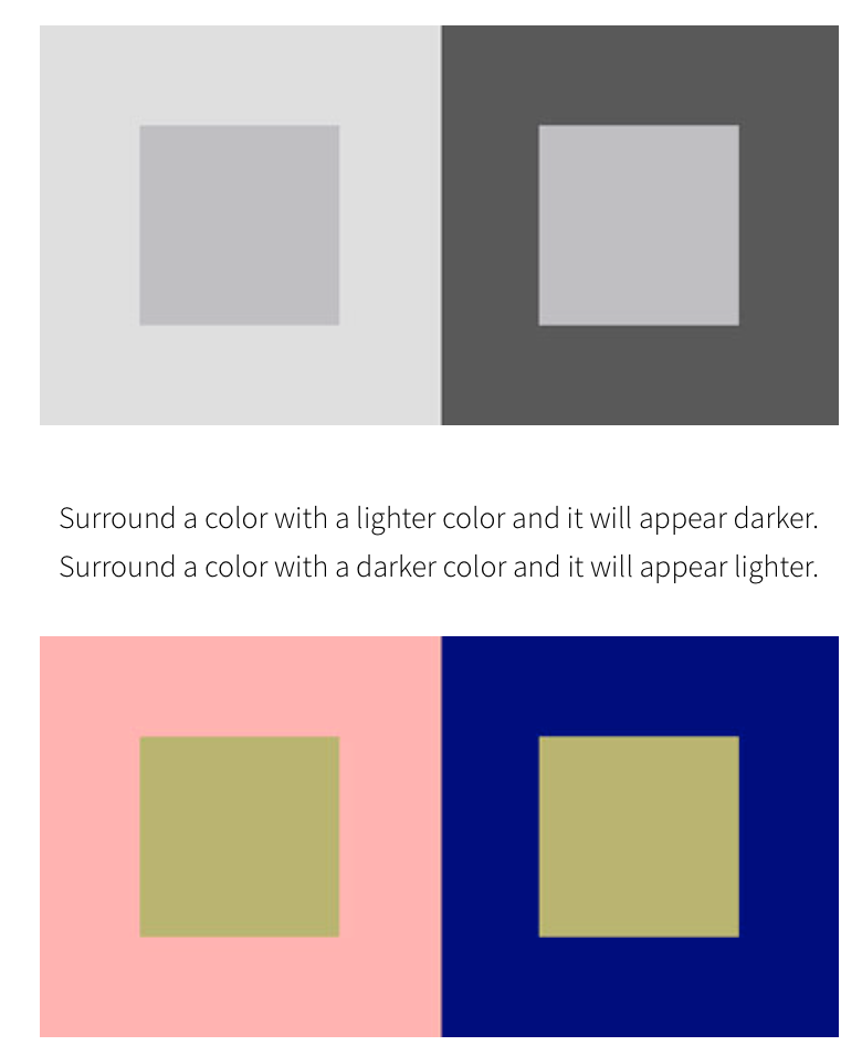
In a study conducted at SCAD in the 2000s, the concept of simultaneous contrast was vividly demonstrated through the painting of squares of different colors within larger squares. The results were illuminating: surround a color with a lighter hue, and it appears darker; surround it with a darker hue, and it appears lighter.
This interplay between light and color is a fascinating aspect of human perception, as these illusions are immeasurable yet profoundly impact how we perceive the lightness of colors.
Light and color are so incredible!
For interior designers, architects, and artists alike, understanding simultaneous contrast is a powerful tool.
By strategically utilizing this phenomenon, designers can manipulate perceptions of space, create visual interest, and evoke specific moods within a room.
Whether it's selecting paint colors, choosing fabrics, or arranging furniture, being mindful of how colors interact with one another can elevate the overall aesthetic and functionality of a space.
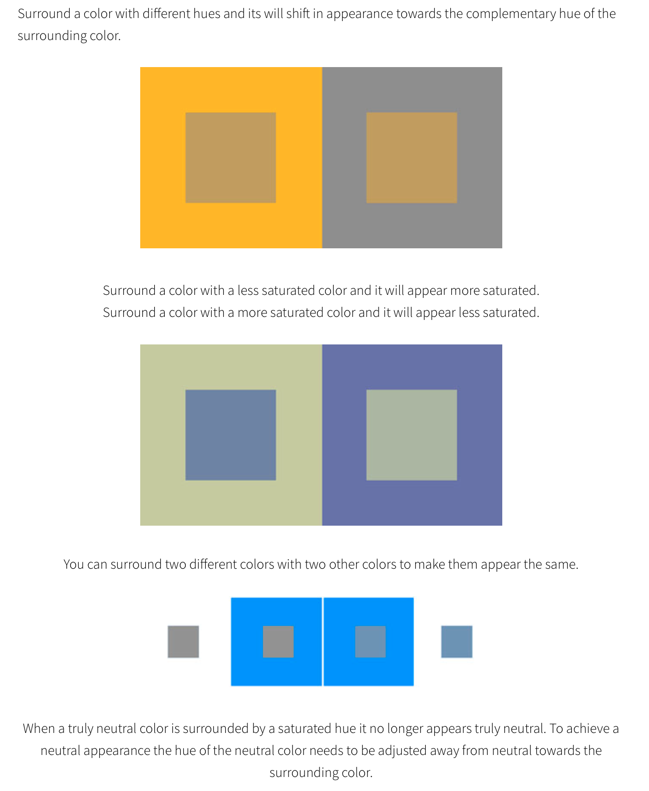
In addition to influencing perceptions of lightness, it can also affect how colors are perceived in terms of warmth, coolness, and saturation. By harnessing the principles of simultaneous contrast, designers can create harmonious color schemes that enhance the overall ambiance of a space.
For those looking to delve deeper into the intricacies of light and color perception, resources such as the article "Simultaneous Contrast" by John Paul Caponigro provide valuable insights and practical applications. By gaining a deeper understanding of simultaneous contrast, designers can unlock new possibilities for creative expression and enrich the sensory experience of interior spaces.

How can we elevate your expectations?
We would love to work with you and demonstrate how.
Embark on a journey with us towards better living through transformative design experiences.
Reach out to start the conversation today.

Business Hours
- Mon - Fri
- -
- Sat - Sun
- Appointment Only